
Whether it’s watching a cable or broadcast news program on TV, reading a national news story online, or just picking up the local newspaper off your driveway (if you’re still doing that like I do), you are bound to have some numbers thrown at you. They will be important-sounding numbers. Authoritative-looking figures. Heck, you might even be told that this is must-see data in a compelling graph or chart. Whatever the case, there is a very good chance that the “data” you see will have been misrepresented, analyzed incorrectly, or offered in lieu of important context that has gone missing. You might feel like Cosmo Kramer, bombarded with wrong numbers every five minutes!

Let’s look at a couple of examples. They’re not egregiously bad, but they’re worthy of comment about how survey data ought not be presented in the news media.
Computer-deprived elderly being snubbed for vaccine shots?
On Florida’s “Treasure Coast” (a three- or four-county area roughly stretching from just north of West Palm Beach up the Atlantic coast to a town called Sebastian), the regional Gannett paper The Stuart News ran a story [$1 paywall link] on February 6, 2021, pointing out how difficult it can be for senior citizens to make COVID vaccine appointments with modern technology like computers, smartphones, and tablets. Which is a fair point to make. But then the obligatory data rolls out.
Vaccination without representation
About 4% of Treasure Coast residents don’t own a computing device, the U.S. Census Bureau’s latest American Community Survey estimates. This includes desktop and laptop computers, smartphones and tablets.
Among those who do have computers, 0.1% use outdated dial-up connections and 7% don’t have internet access. These data were not broken down by age…
Sounds somewhat ominous, but there are at least two other ways this could have been presented:
- About 96% of Treasure Coast residents own a computing device; or,
- Nearly 89% of Treasure Coast residents have modern Internet connections through computing devices they own.
Either of which sounds more hopeful if the vast majority of residents might have a way to be “represented” in the line-up for vaccines. Meanwhile, those few who may not have access or do have some difficulties with technology are being helped by a group calling themselves the Vaccine Angels.
And so the story goes on.
Among people 65 and older, those 85 and older received the fewest vaccinations, TCPalm found in an analysis of statewide data weeks ago. That held through Feb. 3, with the following percentages of people in various age groups receiving shots:
- 55% for people 65-74
- 32% for people 75-84
- 13% for people 85 and older.
It’s impossible to conclude that limited or nonexistent internet access accounts for Florida’s eldest residents receiving the fewest vaccinations. Still, it’s a factor that drives the Angels.
Who is ready to march on Tallahassee with me, to protest why only 13% of the COVID vaccine shots administered to those over the age of 65 have been going in the arms of those 85 and older?! Isn’t this an outrage? Well, now wait a minute… don’t put on your marching boots quite yet. Florida’s governor opened up the vaccine distribution early on to anyone over the age of 65. So, if we sit down and thoughtfully ask — just how many of the people in Florida who are over the age of 65 are also at least 85 years old? It turns out the answer is 13 percent.
That’s exactly the percentage who have received vaccination shots among the over-65 crowd. Furthermore, the population data show that 32% of Floridians over 65 are between 75 and 84; and 55% of Floridians over 65 are between 65 and 74. Take a look again at the vaccine percentages above.
Oh my goodness! Instead of framing the data as a problem that may have been exacerbated by “limited or nonexistent internet access accounts for Florida’s eldest residents”, it could have been characterized more neutrally as data that is “approximately in line with the age distribution of the population”. The data were used to create the appearance of a disproportional disadvantage, when the fact is that the data are very nearly representing exactly proportional equity.
Hardly anyone has heard of QAnon?
Another example of “wrong numbers” is one where important context has gone missing. A cable news channel positioned this one on February 4, 2021 around lunchtime. A number of politicians were in the process of distancing themselves from the group called QAnon, by claiming that they didn’t really know much about QAnon and had frankly barely even heard of it.
An obligatory glimpse at some backing data rolls out; in this case, it’s a Pew Research poll.
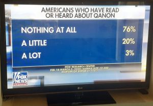
As far as the presented graphic table shows, about three-quarters of Americans say they know “nothing at all” about QAnon, and another one-in-five know only “a little” about the radical group.
There. You see? The politicians who are currently saying (in February 2021) that they barely know anything about QAnon are very much in line with the American population, right? It’s okay to not know anything at all about QAnon in 2021, according to the data!
Hold your horses there, partner.
The Pew Research data was based on a survey that was fielded about 11 months ago, between Feb. 18 and March 2, 2020. Pew also ran a second wave of this survey later in the year, and the percentage who knew “nothing at all” about QAnon in September 2020 had fallen from 76% to 53%. Is it fair to say that society’s awareness of QAnon in late February 2020 is roughly the same as its awareness in September 2020 or in early February 2021? Not at all, and here is why: many more people have searched for information about QAnon in later 2020 than ever before. Proof is in the Google Trends search data:
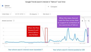
Similarly, the news media have reported on QAnon more and more over time. A search of the Hacker News database reveals 3 stories about QAnon in February 2020, but ten times more in August 2020, and still another 55% more in January 2021.
So, while it is commendable for a news program to show Pew Research survey data to try to educate the viewer, to show year-old numbers (and to ignore more recently-available findings) on a recently-developing subject is…
Well, it’s just wrong numbers every five minutes!
Please share
As a new research business start-up, we are especially thankful at Research Biz to anyone who will take a moment to comment here or to share this post on your own social media networks. If you have your own examples of “wrong numbers every five minutes”, feel free to share them with us, as this is sure to be a continuing series here!
Great job with Episode 1, Greg. I will look forward to further episodes from you. To paraphrase Alexander Pope “A little learning (knowledge) is a dangerous thing”. I share with you the need to examine and verify (or disprove) numbers. Especially those given as an attempt to prove a point.